

Figma
Stark black and white, with color left to the work on show.
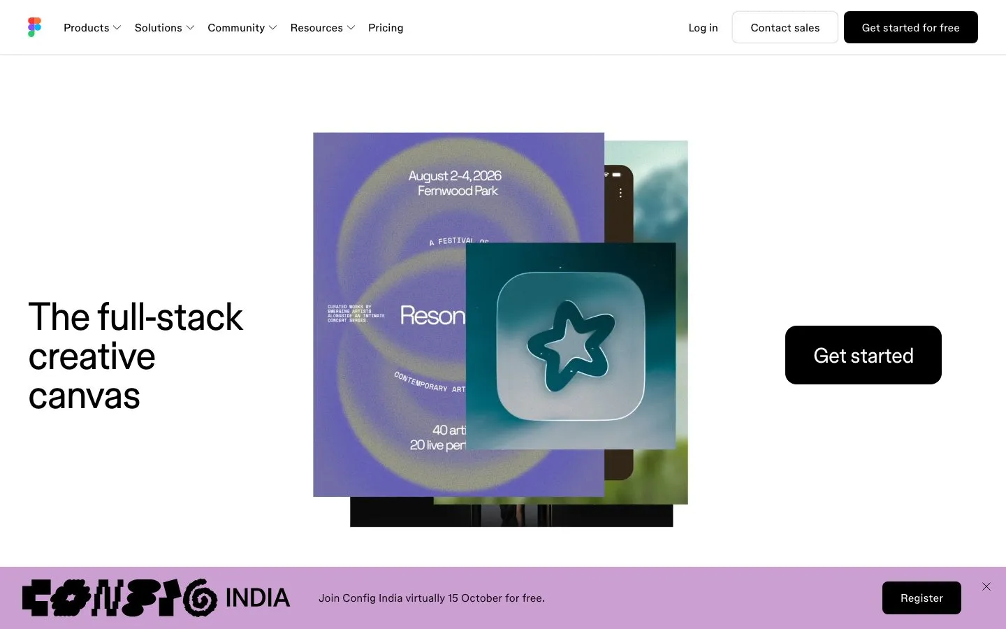
Figma's page is black on white with almost nothing in between: a 56px headline at regular weight, black filled buttons, and a white secondary outlined by a faint inset ring. Body copy runs light, at weight 320. Color lives in the product imagery and the occasional event banner, never in the interface, and corners stay at 8px.
- Use black for every primary action.
- Set headlines at regular weight and body copy light.
- Let imagery bring all of the color.
- Tint buttons with a brand hue.
- Bold the headline.
- Crowd the hero: a headline, an image, and a button are enough.
Color roles
#ffffffThe page ground
#000000Primary ink, 21.0:1 on the background
#757575Supporting copy, 4.6:1 on the background
#000000Primary actions; this system has no brand hue in its controls
#cb9fd2Brand color in artwork, marks and badges
Type
Use Inter. figmaSans is Figma's in-house typeface. Inter is a free stand-in.
Sizes in use: 56px / 30px / 18px / 16px
Spacing
Values sit on a 4px grid.
Corners and depth
Buttons and cards
Rebuilt here from the measured values, not copied from the site's code.
Hand this to your AI coding tool
Drop it in your repo as DESIGN.md and point Claude Code, Cursor or Codex at it before you ask for a page.
# Figma design system

> Captured from https://www.figma.com/ on 2026-10-05 by Brooks New Media (https://design.brooksnewmedia.com/styles/figma/). An independent analysis for reference: Figma and its marks belong to their owner. Learn from the system; don't copy the brand.

## Overview

Figma's page is black on white with almost nothing in between: a 56px headline at regular weight, black filled buttons, and a white secondary outlined by a faint inset ring. Body copy runs light, at weight 320. Color lives in the product imagery and the occasional event banner, never in the interface, and corners stay at 8px.

- Theme: light
- Mood: light, monochrome, creative
- Category: Design tool

## Colors

| Role | Hex | Use |
|---|---|---|
| Background | `#ffffff` | The page ground |
| Text | `#000000` | Primary ink, 21.0:1 on the background |
| Muted text | `#757575` | Supporting copy, 4.6:1 on the background |
| Accent | `#000000` | Primary actions; this system has no brand hue in its controls |
| Highlight | `#cb9fd2` | Brand color in artwork, marks and badges |

Full palette, most used first: `#ffffff`, `#000000`, `#757575`, `#cb9fd2`.

## Typography

- **figmaSans**: display and body, 100% of the text. Use Inter. figmaSans is Figma's in-house typeface. Inter is a free stand-in.

| Role | Family | Size | Weight | Line height | Tracking |
|---|---|---|---|---|---|
| Display | figmaSans | 56px | 400 | 1 | -0.022em |
| Heading | figmaSans | 30px | 400 | 1.2 | -0.022em |
| Subheading | figmaSans | 16px | 400 | 1.4 | 0 |
| Body | figmaSans | 16px | 320 | 1.45 | 0 |

Sizes in use, largest first: 56px, 30px, 18px, 16px.

## Spacing

Values sit on a 4px grid.
Values in use: 2px, 4px, 6px, 8px, 12px, 16px, 22px, 24px, 32px, 80px.

## Shape

Corner radii, smallest first: 2px, 8px, pill (9999px).

Shadows, most used first:

- `oklch(0 0 none / 0.16) 0px 1px 0px 0px`
- `oklch(0 0 none / 0.16) 0px 0px 0px 1px inset`

## Components

### Primary button ("Register")

- Fill: #000000
- Text: #ffffff, 16px at weight 400
- Border: none
- Corner: 8px
- Height: 46px, padding 12px 22px

### Secondary button ("Contact sales")

- Fill: transparent
- Text: #000000, 16px at weight 400
- Border: none
- Ring or shadow: `oklch(0 0 none / 0.16) 0px 0px 0px 1px inset`
- Corner: 8px
- Height: 46px, padding 12px 22px

## Do

- Use black for every primary action.
- Set headlines at regular weight and body copy light.
- Let imagery bring all of the color.

## Don't

- Tint buttons with a brand hue.
- Bold the headline.
- Crowd the hero: a headline, an image, and a button are enough.

## CSS variables

```css
:root {
  --color-background: #ffffff;
  --color-text: #000000;
  --color-text-muted: #757575;
  --color-accent: #000000;
  --color-highlight: #cb9fd2;
  --font-display: "figmaSans", "Inter", system-ui, sans-serif;
  --text-display: 56px;
  --weight-display: 400;
  --font-heading: "figmaSans", "Inter", system-ui, sans-serif;
  --text-heading: 30px;
  --weight-heading: 400;
  --font-subheading: "figmaSans", "Inter", system-ui, sans-serif;
  --text-subheading: 16px;
  --weight-subheading: 400;
  --font-body: "figmaSans", "Inter", system-ui, sans-serif;
  --text-body: 16px;
  --weight-body: 320;
  --space-1: 2px;
  --space-2: 4px;
  --space-3: 6px;
  --space-4: 8px;
  --space-5: 12px;
  --space-6: 16px;
  --space-7: 22px;
  --space-8: 24px;
  --space-9: 32px;
  --space-10: 80px;
  --radius-1: 2px;
  --radius-2: 8px;
  --radius-3: 9999px;
}
```

## Notes for AI coding tools

- Start from the CSS variables above and build components from them, not from new values.
- Use the font substitutes listed. Never embed a commercial or platform-only typeface without a license.
- Keep body text at 4.5:1 contrast or better against its ground.
- These values were measured from the live page at 1440x900; the site may have changed since 2026-10-05.
Figma and its marks belong to their owner. This page is an independent analysis of the public website, measured on 2026-10-05. We're not affiliated with or endorsed by Figma.