

Phish
A full-bleed tour poster on top, a quiet off-white page underneath.
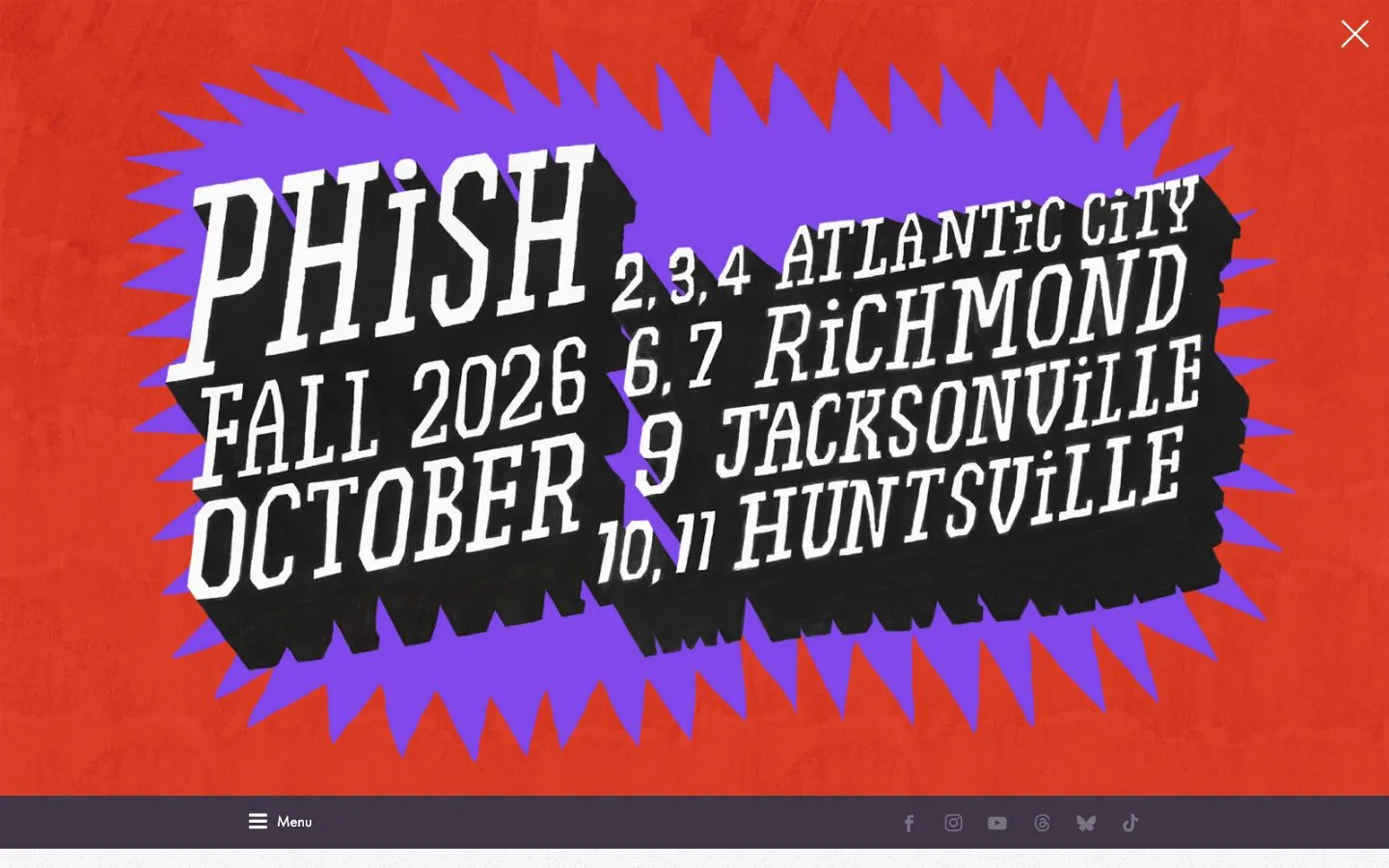
Phish leads with a hand-lettered tour poster that fills the first screen, then drops to a calm #f6f7f5 page with warm #535046 ink and #e36740 orange for the marks that matter. One geometric family, Function Pro, does everything from 72px bold display down to 14px tracked uppercase labels, and pills are the only rounded shape.
- Let one commissioned poster carry the whole first screen.
- Drop to a soft off-white and warm grey ink below it so the art stays the loudest thing.
- Run every size from one geometric family and set small labels in tracked uppercase.
- Use pure black text on the off-white: the ink here is a warm #535046.
- Put the orange on body copy: at 3.1:1 it only works on large marks and buttons.
- Add more than one rounded shape: pills are the only radius on the page.
Color roles
#f6f7f5The page ground
#413648Raised panels, bands and cards
#535046Primary ink, 7.5:1 on the background
#68947cSupporting copy, 3.2:1 on the background
#e36740Primary actions
#e4e6ecHairlines and dividers
Type
Use Outfit. Function Pro is a paid typeface. Outfit is a free stand-in, not a match.
Use Outfit. The demibold cut of Function Pro, a paid typeface.
Use Outfit. The medium cut of Function Pro, a paid typeface.
Use Outfit. The book bold cut of Function Pro, a paid typeface.
Sizes in use: 72px / 24px / 20px / 18px / 16px / 14px / 12px / 10px
Spacing
No single base unit: these are the values the page repeats.
Corners and depth
Buttons and cards
Rebuilt here from the measured values, not copied from the site's code.
No repeated button or card treatment was found above the fold.
Hand this to your AI coding tool
Drop it in your repo as DESIGN.md and point Claude Code, Cursor or Codex at it before you ask for a page.
# Phish design system

> Captured from https://phish.com/ on 2026-10-05 by Brooks New Media (https://design.brooksnewmedia.com/styles/phish/). An independent analysis for reference: Phish and its marks belong to their owner. Learn from the system; don't copy the brand.

## Overview

Phish leads with a hand-lettered tour poster that fills the first screen, then drops to a calm #f6f7f5 page with warm #535046 ink and #e36740 orange for the marks that matter. One geometric family, Function Pro, does everything from 72px bold display down to 14px tracked uppercase labels, and pills are the only rounded shape.

- Theme: light
- Mood: poster, jam band, tour dates, warm, illustrated
- Category: Band

## Colors

| Role | Hex | Use |
|---|---|---|
| Background | `#f6f7f5` | The page ground |
| Surface | `#413648` | Raised panels, bands and cards |
| Text | `#535046` | Primary ink, 7.5:1 on the background |
| Muted text | `#68947c` | Supporting copy, 3.2:1 on the background |
| Accent | `#e36740` | Primary actions |
| Border | `#e4e6ec` | Hairlines and dividers |

Full palette, most used first: `#535046`, `#f6f7f5`, `#413648`, `#ffffff`, `#000000`, `#e36740`, `#68947c`, `#7e668e`.

## Typography

- **function_probook**: display and body, 81.8% of the text. Use Outfit. Function Pro is a paid typeface. Outfit is a free stand-in, not a match.
- **function_prodemi**: display and body, 8.1% of the text. Use Outfit. The demibold cut of Function Pro, a paid typeface.
- **function_promedium**: body, 7.8% of the text. Use Outfit. The medium cut of Function Pro, a paid typeface.
- **function_pro_bookbold**: display and body, 2.2% of the text. Use Outfit. The book bold cut of Function Pro, a paid typeface.

| Role | Family | Size | Weight | Line height | Tracking |
|---|---|---|---|---|---|
| Display | function_probook | 72px | 700 | 1.2 | 0 |
| Heading | function_probook | 24px | 700 | 1 | 0 |
| Subheading | function_promedium | 18px | 400 | 1.2 | 0 |
| Body | function_probook | 16px | 400 | 1.4 | 0 |
| Small | function_probook | 14px | 400 | 1 | 0.143em |

Sizes in use, largest first: 72px, 24px, 20px, 18px, 16px, 14px, 12px, 10px.

## Spacing

No single base unit: the values below are what the page repeats.
Values in use: 3px, 7px, 10px, 14px, 18px.

## Shape

Corner radii, smallest first: pill (9999px).

No shadows: depth comes from color and borders.

## Components

No repeated button or card treatment was found above the fold.

## Do

- Let one commissioned poster carry the whole first screen.
- Drop to a soft off-white and warm grey ink below it so the art stays the loudest thing.
- Run every size from one geometric family and set small labels in tracked uppercase.

## Don't

- Use pure black text on the off-white: the ink here is a warm #535046.
- Put the orange on body copy: at 3.1:1 it only works on large marks and buttons.
- Add more than one rounded shape: pills are the only radius on the page.

## CSS variables

```css
:root {
  --color-background: #f6f7f5;
  --color-surface: #413648;
  --color-text: #535046;
  --color-text-muted: #68947c;
  --color-accent: #e36740;
  --color-border: #e4e6ec;
  --font-display: "function_probook", system-ui, sans-serif;
  --text-display: 72px;
  --weight-display: 700;
  --font-heading: "function_probook", system-ui, sans-serif;
  --text-heading: 24px;
  --weight-heading: 700;
  --font-subheading: "function_promedium", system-ui, sans-serif;
  --text-subheading: 18px;
  --weight-subheading: 400;
  --font-body: "function_probook", system-ui, sans-serif;
  --text-body: 16px;
  --weight-body: 400;
  --font-small: "function_probook", system-ui, sans-serif;
  --text-small: 14px;
  --weight-small: 400;
  --space-1: 3px;
  --space-2: 7px;
  --space-3: 10px;
  --space-4: 14px;
  --space-5: 18px;
  --radius-1: 9999px;
}
```

## Notes for AI coding tools

- Start from the CSS variables above and build components from them, not from new values.
- Use the font substitutes listed. Never embed a commercial or platform-only typeface without a license.
- Keep body text at 4.5:1 contrast or better against its ground.
- These values were measured from the live page at 1440x900; the site may have changed since 2026-10-05.
Phish and its marks belong to their owner. This page is an independent analysis of the public website, measured on 2026-10-05. We're not affiliated with or endorsed by Phish.