

Supabase
Developer-clean white, a two-tone headline, and one deep green.
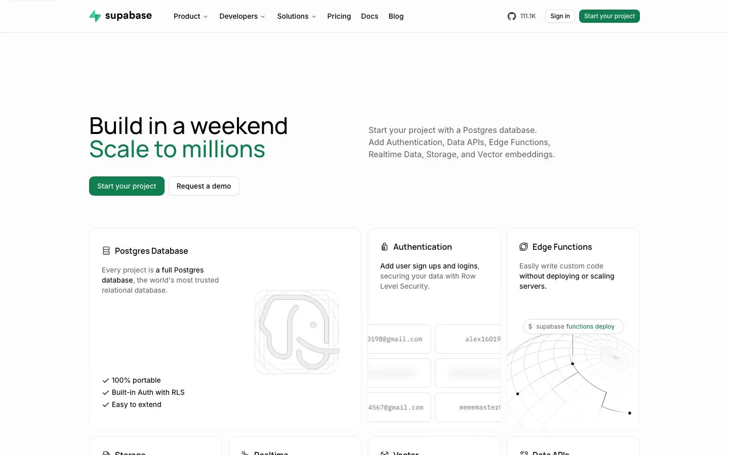
Captured in light mode, Supabase is crisp white with near-black ink and a deep green (#0e7e4e) that marks both the primary button and the second line of the headline. Feature cards have fine light outlines and soft 16px corners, and their grey copy sets key phrases in black. Supabase follows the visitor's system theme, so dark mode visitors see a different palette.
- Use the green for the primary action and one accent phrase.
- Outline cards with a fine light line and round them near 16px.
- Mix grey and black inside one sentence to stress the key words.
- Fill large backgrounds with the green.
- Give cards heavy drop shadows.
- Design only one theme: this system ships light and dark.
Color roles
#fdfdfdThe page ground
#030303Primary ink, 20.3:1 on the background
#696969Supporting copy, 5.4:1 on the background
#0e7e4ePrimary actions
#e8e8e8Hairlines and dividers
Type
Use Inter. Free under the SIL Open Font License.
Use Manrope. Free under the SIL Open Font License.
Sizes in use: 46px / 34px / 22px / 16px / 14px / 12px
Spacing
Values sit on a 4px grid.
Corners and depth
Buttons and cards
Rebuilt here from the measured values, not copied from the site's code.
Hand this to your AI coding tool
Drop it in your repo as DESIGN.md and point Claude Code, Cursor or Codex at it before you ask for a page.
# Supabase design system

> Captured from https://supabase.com/ on 2026-10-05 by Brooks New Media (https://design.brooksnewmedia.com/styles/supabase/). An independent analysis for reference: Supabase and its marks belong to their owner. Learn from the system; don't copy the brand.

## Overview

Captured in light mode, Supabase is crisp white with near-black ink and a deep green (#0e7e4e) that marks both the primary button and the second line of the headline. Feature cards have fine light outlines and soft 16px corners, and their grey copy sets key phrases in black. Supabase follows the visitor's system theme, so dark mode visitors see a different palette.

- Theme: light
- Mood: light, developer, green
- Category: Developer platform

## Colors

| Role | Hex | Use |
|---|---|---|
| Background | `#fdfdfd` | The page ground |
| Text | `#030303` | Primary ink, 20.3:1 on the background |
| Muted text | `#696969` | Supporting copy, 5.4:1 on the background |
| Accent | `#0e7e4e` | Primary actions |
| Border | `#e8e8e8` | Hairlines and dividers |

Full palette, most used first: `#fdfdfd`, `#696969`, `#030303`, `#0e7e4e`, `#464646`.

## Typography

- **Inter**: body, 82.9% of the text. Use Inter. Free under the SIL Open Font License.
- **Manrope**: display, 17.1% of the text. Use Manrope. Free under the SIL Open Font License.

| Role | Family | Size | Weight | Line height | Tracking |
|---|---|---|---|---|---|
| Display | Manrope | 46px | 500 | 1 | 0 |
| Heading | Manrope | 34px | 600 | 1.11 | 0 |
| Subheading | Manrope | 16px | 600 | 1.5 | 0 |
| Body | Inter | 14px | 450 | 1.43 | 0 |
| Small | Inter | 12px | 500 | 1.33 | 0 |

Sizes in use, largest first: 46px, 34px, 22px, 16px, 14px, 12px.

## Spacing

Values sit on a 4px grid.
Values in use: 4px, 6px, 8px, 10px, 12px, 16px, 20px, 24px, 32px, 40px, 96px.

## Shape

Corner radii, smallest first: 8px, 9px, 11px, 15px, 16px, pill (9999px).

Shadows, most used first:

- `rgba(0, 0, 0, 0.04) 0px 1px 3px 0px, rgba(0, 0, 0, 0.027) 0px 1px 0px 0px inset, rgba(0, 0, 0, 0.04) 0px 0px 0px 1px inset, rgba(0, 0, 0, 0.04) 0px -1px 0px 0px inset, rgba(0, 0, 0, 0.067) 0px 0px 0px 1px inset`
- `rgba(0, 0, 0, 0.04) 0px 1px 3px 0px, rgba(0, 0, 0, 0.027) 0px 1px 0px 0px inset, rgba(0, 0, 0, 0.04) 0px 0px 0px 1px inset, rgba(0, 0, 0, 0.067) 0px 0px 0px 1px inset`
- `rgba(0, 0, 0, 0.1) 0px 10px 15px -3px, rgba(0, 0, 0, 0.1) 0px 4px 6px -4px`

## Components

### Primary button ("Start your project")

- Fill: #0e7e4e
- Text: #fafcfb, 14px at weight 500
- Border: none
- Ring or shadow: `rgba(0, 0, 0, 0.04) 0px 1px 3px 0px, rgba(0, 0, 0, 0.027) 0px 1px 0px 0px inset, rgba(0, 0, 0, 0.04) 0px 0px 0px 1px inset, rgba(0, 0, 0, 0.067) 0px 0px 0px 1px inset`
- Corner: 9px
- Height: 38px, padding 8px 16px

### Secondary button ("Request a demo")

- Fill: #ffffff
- Text: #030303, 14px at weight 500
- Border: none
- Ring or shadow: `rgba(0, 0, 0, 0.04) 0px 1px 3px 0px, rgba(0, 0, 0, 0.027) 0px 1px 0px 0px inset, rgba(0, 0, 0, 0.04) 0px 0px 0px 1px inset, rgba(0, 0, 0, 0.04) 0px -1px 0px 0px inset, rgba(0, 0, 0, 0.067) 0px 0px 0px 1px inset`
- Corner: 9px
- Height: 38px, padding 8px 16px

### Card

- Fill: #ffffff
- Border: none
- Corner: 16px
- Shadow: none

## Do

- Use the green for the primary action and one accent phrase.
- Outline cards with a fine light line and round them near 16px.
- Mix grey and black inside one sentence to stress the key words.

## Don't

- Fill large backgrounds with the green.
- Give cards heavy drop shadows.
- Design only one theme: this system ships light and dark.

## CSS variables

```css
:root {
  --color-background: #fdfdfd;
  --color-text: #030303;
  --color-text-muted: #696969;
  --color-accent: #0e7e4e;
  --color-border: #e8e8e8;
  --font-display: "Manrope", "Manrope", system-ui, sans-serif;
  --text-display: 46px;
  --weight-display: 500;
  --font-heading: "Manrope", "Manrope", system-ui, sans-serif;
  --text-heading: 34px;
  --weight-heading: 600;
  --font-subheading: "Manrope", "Manrope", system-ui, sans-serif;
  --text-subheading: 16px;
  --weight-subheading: 600;
  --font-body: "Inter", "Inter", system-ui, sans-serif;
  --text-body: 14px;
  --weight-body: 450;
  --font-small: "Inter", "Inter", system-ui, sans-serif;
  --text-small: 12px;
  --weight-small: 500;
  --space-1: 4px;
  --space-2: 6px;
  --space-3: 8px;
  --space-4: 10px;
  --space-5: 12px;
  --space-6: 16px;
  --space-7: 20px;
  --space-8: 24px;
  --space-9: 32px;
  --space-10: 40px;
  --space-11: 96px;
  --radius-1: 8px;
  --radius-2: 9px;
  --radius-3: 11px;
  --radius-4: 15px;
  --radius-5: 16px;
  --radius-6: 9999px;
}
```

## Notes for AI coding tools

- Start from the CSS variables above and build components from them, not from new values.
- Use the font substitutes listed. Never embed a commercial or platform-only typeface without a license.
- Keep body text at 4.5:1 contrast or better against its ground.
- These values were measured from the live page at 1440x900; the site may have changed since 2026-10-05.
Supabase and its marks belong to their owner. This page is an independent analysis of the public website, measured on 2026-10-05. We're not affiliated with or endorsed by Supabase.