

The Strokes
An old desktop operating system rebuilt as a band homepage.
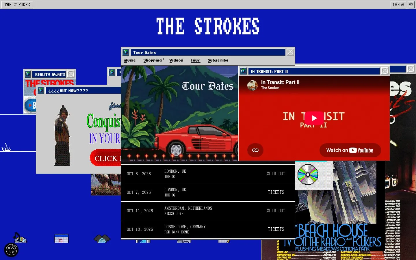
The Strokes site is a retro desktop: a #0b17b4 blue screen, #cccccc grey window chrome, black and white text, and overlapping windows for tour dates, videos and the store. Every label is a bitmap DOS-style face at 12 to 17px, mostly uppercase, and corners stay at 3px. It is a gimmick done with total commitment.
- Commit to one interface metaphor and build every section inside it.
- Use a bitmap face at small sizes for every label.
- Keep corners at a few pixels, like old window chrome.
- Mix in a modern sans: it breaks the illusion.
- Use soft, large shadows.
- Use the blue for small text on black.
Color roles
#ccccccThe page ground
#000000Raised panels, bands and cards
#000000Primary ink, 13.1:1 on the background
#0b17b4Primary actions
#ffffffHairlines and dividers
Type
Use VT323. webdos24, a bitmap PC-style face, looks like a custom or licensed face and we could not confirm its license, so treat it as paid. VT323 is a free stand-in, not a match.
Use VT323. webdos16, a bitmap PC-style face, looks like a custom or licensed face and we could not confirm its license, so treat it as paid. VT323 is a free stand-in, not a match.
Use Silkscreen. screenstar looks like a custom or licensed face and we could not confirm its license, so treat it as paid. Silkscreen is a free stand-in, not a match.
Use Tinos. Times ships with most systems. Tinos is a free stand-in that matches its metrics.
Sizes in use: 17px / 16px / 15px / 14px / 13px / 12px / 10px / 9px
Spacing
No single base unit: these are the values the page repeats.
Corners and depth
Buttons and cards
Rebuilt here from the measured values, not copied from the site's code.
No repeated button or card treatment was found above the fold.
Hand this to your AI coding tool
Drop it in your repo as DESIGN.md and point Claude Code, Cursor or Codex at it before you ask for a page.
# The Strokes design system

> Captured from https://www.thestrokes.com/ on 2026-10-05 by Brooks New Media (https://design.brooksnewmedia.com/styles/the-strokes/). An independent analysis for reference: The Strokes and its marks belong to their owner. Learn from the system; don't copy the brand.

## Overview

The Strokes site is a retro desktop: a #0b17b4 blue screen, #cccccc grey window chrome, black and white text, and overlapping windows for tour dates, videos and the store. Every label is a bitmap DOS-style face at 12 to 17px, mostly uppercase, and corners stay at 3px. It is a gimmick done with total commitment.

- Theme: light
- Mood: retro, desktop, pixel, blue, playful
- Category: Band

## Colors

| Role | Hex | Use |
|---|---|---|
| Background | `#cccccc` | The page ground |
| Surface | `#000000` | Raised panels, bands and cards |
| Text | `#000000` | Primary ink, 13.1:1 on the background |
| Accent | `#0b17b4` | Primary actions |
| Border | `#ffffff` | Hairlines and dividers |

Full palette, most used first: `#ffffff`, `#0b17b4`, `#000000`, `#cccccc`, `#011e75`.

## Typography

- **webdos24**: body, 58.8% of the text. Use VT323. webdos24, a bitmap PC-style face, looks like a custom or licensed face and we could not confirm its license, so treat it as paid. VT323 is a free stand-in, not a match.
- **webdos16**: display and body, 21% of the text. Use VT323. webdos16, a bitmap PC-style face, looks like a custom or licensed face and we could not confirm its license, so treat it as paid. VT323 is a free stand-in, not a match.
- **screenstar**: display and body, 16.1% of the text. Use Silkscreen. screenstar looks like a custom or licensed face and we could not confirm its license, so treat it as paid. Silkscreen is a free stand-in, not a match.
- **times**: display and body, 3.6% of the text. Use Tinos. Times ships with most systems. Tinos is a free stand-in that matches its metrics.

| Role | Family | Size | Weight | Line height | Tracking |
|---|---|---|---|---|---|
| Display | screenstar | 17px | 400 | normal | 0 |
| Heading | screenstar | 17px | 400 | normal | 0 |
| Body | webdos24 | 14px | 400 | normal | 0.036em |
| Small | webdos24 | 12px | 400 | normal | 0.042em |

Sizes in use, largest first: 17px, 16px, 15px, 14px, 13px, 12px, 10px, 9px.

## Spacing

No single base unit: the values below are what the page repeats.
Values in use: 3px, 10px, 14px, 20px.

## Shape

Corner radii, smallest first: 3px, pill (9999px).

Shadows, most used first:

- `rgba(0, 0, 0, 0.2) 0px 4px 8px 0px`

## Components

No repeated button or card treatment was found above the fold.

## Do

- Commit to one interface metaphor and build every section inside it.
- Use a bitmap face at small sizes for every label.
- Keep corners at a few pixels, like old window chrome.

## Don't

- Mix in a modern sans: it breaks the illusion.
- Use soft, large shadows.
- Use the blue for small text on black.

## CSS variables

```css
:root {
  --color-background: #cccccc;
  --color-surface: #000000;
  --color-text: #000000;
  --color-accent: #0b17b4;
  --color-border: #ffffff;
  --font-display: "screenstar", system-ui, sans-serif;
  --text-display: 17px;
  --weight-display: 400;
  --font-heading: "screenstar", system-ui, sans-serif;
  --text-heading: 17px;
  --weight-heading: 400;
  --font-body: "webdos24", system-ui, sans-serif;
  --text-body: 14px;
  --weight-body: 400;
  --font-small: "webdos24", system-ui, sans-serif;
  --text-small: 12px;
  --weight-small: 400;
  --space-1: 3px;
  --space-2: 10px;
  --space-3: 14px;
  --space-4: 20px;
  --radius-1: 3px;
  --radius-2: 9999px;
}
```

## Notes for AI coding tools

- Start from the CSS variables above and build components from them, not from new values.
- Use the font substitutes listed. Never embed a commercial or platform-only typeface without a license.
- Keep body text at 4.5:1 contrast or better against its ground.
- These values were measured from the live page at 1440x900; the site may have changed since 2026-10-05.
The Strokes and its marks belong to their owner. This page is an independent analysis of the public website, measured on 2026-10-05. We're not affiliated with or endorsed by The Strokes.