

Outside Lands
Cream ground, pink buttons and very wide, very heavy display type.
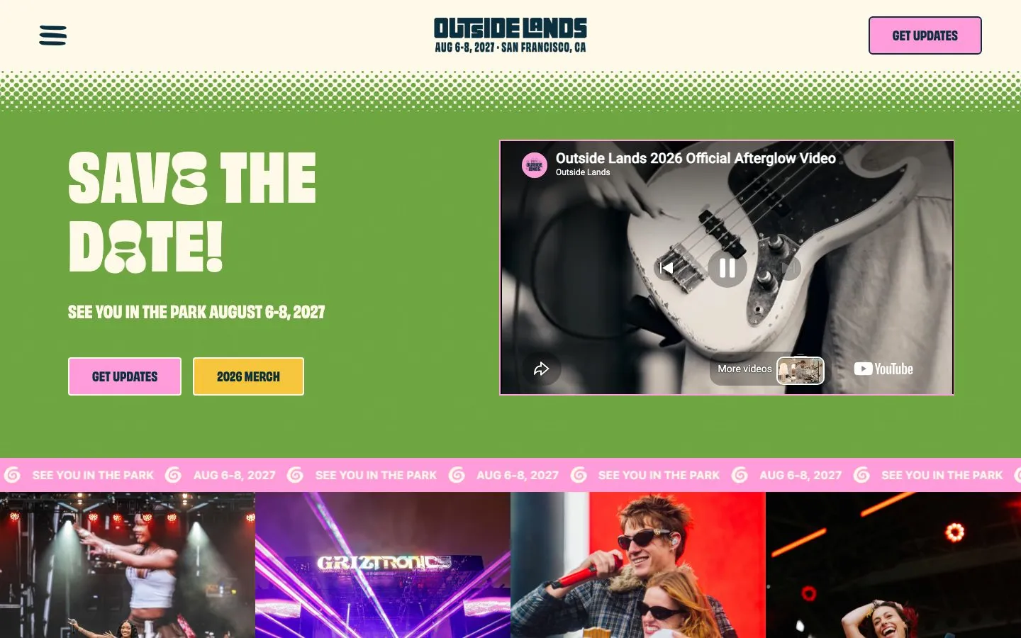
Outside Lands uses a #fff9e9 cream ground with #0a2f3f deep teal ink, #ff9cd9 pink buttons, #ef8516 orange and #6ea541 green. The display face is Obviously in its narrow cut at 94px and 900 weight, uppercase, over the system UI font for body text. Buttons are pink with 4px corners and a 2px cream border.
- Set the hero in the heaviest uppercase you have, at 90px or more.
- Use pink for the main buttons with dark teal labels.
- Let the system font carry body text so the display face stands alone.
- Use pink text on cream: it is 1.8:1.
- Use a light display weight.
- Add soft shadows.
Color roles
#fff9e9The page ground
#4d5058Raised panels, bands and cards
#0a2f3fPrimary ink, 13.4:1 on the background
#ff9cd9Primary actions
#ef8516Brand color in artwork, marks and badges
#ff9cd9Hairlines and dividers
Type
Use system-ui. The system UI font: San Francisco on Apple devices, Segoe UI on Windows. Nothing to license or load.
Use Archivo (wide, black). Obviously is a paid typeface. Archivo at its black weight is a free stand-in, not a match.
Sizes in use: 94px / 24px / 18px / 16px / 14px
Spacing
Values sit on a 8px grid.
Corners and depth
Buttons and cards
Rebuilt here from the measured values, not copied from the site's code.
Hand this to your AI coding tool
Drop it in your repo as DESIGN.md and point Claude Code, Cursor or Codex at it before you ask for a page.
# Outside Lands design system

> Captured from https://www.sfoutsidelands.com/ on 2026-10-05 by Brooks New Media (https://design.brooksnewmedia.com/styles/outside-lands/). An independent analysis for reference: Outside Lands and its marks belong to their owner. Learn from the system; don't copy the brand.

## Overview

Outside Lands uses a #fff9e9 cream ground with #0a2f3f deep teal ink, #ff9cd9 pink buttons, #ef8516 orange and #6ea541 green. The display face is Obviously in its narrow cut at 94px and 900 weight, uppercase, over the system UI font for body text. Buttons are pink with 4px corners and a 2px cream border.

- Theme: light
- Mood: cream, pink, heavy type, park, playful
- Category: Festival

## Colors

| Role | Hex | Use |
|---|---|---|
| Background | `#fff9e9` | The page ground |
| Surface | `#4d5058` | Raised panels, bands and cards |
| Text | `#0a2f3f` | Primary ink, 13.4:1 on the background |
| Accent | `#ff9cd9` | Primary actions |
| Highlight | `#ef8516` | Brand color in artwork, marks and badges |
| Border | `#ff9cd9` | Hairlines and dividers |

Full palette, most used first: `#fff9e9`, `#ef8516`, `#4d5058`, `#0a2f3f`, `#6ea541`, `#ff9cd9`, `#000000`.

## Typography

- **ui-sans-serif**: display and body, 95.3% of the text. Use system-ui. The system UI font: San Francisco on Apple devices, Segoe UI on Windows. Nothing to license or load.
- **obviously**: body, 4.1% of the text. Use Archivo (wide, black). Obviously is a paid typeface. Archivo at its black weight is a free stand-in, not a match.

| Role | Family | Size | Weight | Line height | Tracking |
|---|---|---|---|---|---|
| Display | obviously-narrow | 93.6px | 900 | 0.9 | 0.02em |
| Heading | obviously | 24px | 700 | 1.33 | 0 |
| Subheading | obviously | 18px | 700 | 1 | 0 |
| Body | ui-sans-serif | 16px | 700 | 1.5 | 0 |
| Small | ui-sans-serif | 14px | 400 | 1.43 | 0 |

Sizes in use, largest first: 94px, 24px, 18px, 16px, 14px.

## Spacing

Values sit on a 8px grid.
Values in use: 16px, 24px, 32px.

## Shape

Corner radii, smallest first: 4px, 6px.

No shadows: depth comes from color and borders.

## Components

### Primary button ("GET UPDATES")

- Fill: #ff9cd9
- Text: #0a2f3f, 18px at weight 700
- Border: 2px solid #fff9e9
- Corner: 4px
- Height: 54px, padding 16px 32px

### Secondary button ("2026 MERCH")

- Fill: #f7c63d
- Text: #0a2f3f, 18px at weight 700
- Border: 2px solid #fff9e9
- Corner: 4px
- Height: 54px, padding 16px 32px

## Do

- Set the hero in the heaviest uppercase you have, at 90px or more.
- Use pink for the main buttons with dark teal labels.
- Let the system font carry body text so the display face stands alone.

## Don't

- Use pink text on cream: it is 1.8:1.
- Use a light display weight.
- Add soft shadows.

## CSS variables

```css
:root {
  --color-background: #fff9e9;
  --color-surface: #4d5058;
  --color-text: #0a2f3f;
  --color-accent: #ff9cd9;
  --color-highlight: #ef8516;
  --color-border: #ff9cd9;
  --font-display: "obviously-narrow", system-ui, sans-serif;
  --text-display: 93.6px;
  --weight-display: 900;
  --font-heading: "obviously", system-ui, sans-serif;
  --text-heading: 24px;
  --weight-heading: 700;
  --font-subheading: "obviously", system-ui, sans-serif;
  --text-subheading: 18px;
  --weight-subheading: 700;
  --font-body: "ui-sans-serif", system-ui, sans-serif;
  --text-body: 16px;
  --weight-body: 700;
  --font-small: "ui-sans-serif", system-ui, sans-serif;
  --text-small: 14px;
  --weight-small: 400;
  --space-1: 16px;
  --space-2: 24px;
  --space-3: 32px;
  --radius-1: 4px;
  --radius-2: 6px;
}
```

## Notes for AI coding tools

- Start from the CSS variables above and build components from them, not from new values.
- Use the font substitutes listed. Never embed a commercial or platform-only typeface without a license.
- Keep body text at 4.5:1 contrast or better against its ground.
- These values were measured from the live page at 1440x900; the site may have changed since 2026-10-05.
Outside Lands and its marks belong to their owner. This page is an independent analysis of the public website, measured on 2026-10-05. We're not affiliated with or endorsed by Outside Lands.